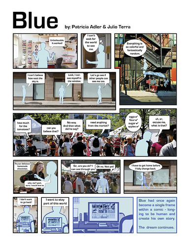
Today I will share a short comic that I composed with Patricia Adler for my Communication Lab class. I will also describe the development process for creating this piece, from ideation through production. In short, this comic was the fruit of a brainstorming session and was produced using illustrator, photoshop and indesign. It features pictures from flickr coupled with some of our own.

Ideation
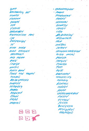
To come up with an idea for the comic, Patricia and I held a short brainstorm. During this 20-minute session we used free-association to generate a list of seed words to serve as inspiration for our story. Once we jotted down about 50 different thoughts we stopped developing new ideas and begun a grouping exercise. Here is a scan of the notes from our brainstorming - good luck reading my hand-writting.

This phase of the process is focused on identifying interesting themes, patterns, or inspiration that arises from the list of words. We identified the following main themes from our list: food and sensations, soft versus hard, transitions and passages, madness and sickness. During this process Patricia brought up a desire to work with colors. This, coupled with a momentary fascination with the grid paper on which we was taking note, led us to the inspiration for our story.
The initial idea for the story was about a colored shape that dreamt of being human. We liked the idea of an inanimate and abstract object, such as a shape, to be able to dream of being human. Once we agreed to pursue this area we started focusing on developing an actual story. We continued to develop this idea by exploring the notion of a square on a grid on a notebook that dreams of being human, to finally arrived at the place at which we ended up - the story about a frame from a comic that longs to be human.
We then worked on coming up with a short description of each frame of the story. This is where Scott McCloud's book was most helpful. It helped guide many of our conversations about how to manage time and craft the representation of our characters. At the end of this phase we also defined what source materials were needed, such as photo needs and copy.
Production
The first thing we did was to produce this comic was to look for pictures on flickr that met the requirements of our frame descriptions. After a few hours of searching for photos we determined that we would need to take our own pictures for the main character, which we did.
Once we found most of the pictures we needed we used the pen tool on Adobe Illustrator to create an outline of the main character for each frame. This process was timing consuming but enjoyable (at least for me). The most difficult images to create were the outlines of the objects that are behind Blue on the frames in which he becomes transparent - these were also created using Illustrator.
The next step in the process was to put together the final image compositions by retouching the pictures (thanks Patricia for doing most of the work here) and including the talk/thought bubbles and text boxes. Photoshop was used for all of this work. Once all the images were ready we InDesign to create the final layout. We had to go back and forth between Photoshop and InDesign to adjust the pictures to fit the visual and text in the layout clearly.
It is important to note that even though I am dividing the following activities into a "production" stage, we continued to iterate through changes in the storyline until the last day. Spending sufficient upfront time making sure our idea was solid helped us avoid rework during production.
Image Credits
- Frame 1 and 10 - Office picture - Jeremy Levine
- Frame 3 - Building with stairs picture - Moriza
- Frame 4 and 8 - Man walking down street - Julien's
- Frame 5 - Farmer's market picture - Ed Yourdon
No comments:
Post a Comment