Showing posts with label experience design. Show all posts

Sunday, August 16, 2009

Adam Greenfield's Principles of Ubiquitous Computing

Since I was introduced to Adam Greenfield via the July/August issue of Interactions magazine I have been searching for more content from him - essentially, I am trying to catch up on the last few years of Adam's writings regarding ubicomp since he offers unique and informed perspectives on this emergent phenomena. Needless to say, I have a long ways to go because much has been written and said by Mr. Greenfield.

Taking it one step at time, here I am going to focus on a set of principles for the design and implementation of ubiquitous computing that he has developed. These principles were shared back in 2006 in a talk that he gave titled Here, There and Everywhere: Issues in Cross-Cultural Ubiquitous Computing, which was delivered shortly after he wrote his first book.

I suspect that many of these ideas are captured in his book in greater depth, I will confirm that this is the case as soon as I get around to reading Everyware. I came across this information on the We Make Money Not Art blog, here is a direct link to the article.

What is the purpose and role of these principles: now that ubicomp is actually becoming ubiquitous it is important that devices and applications that deliver this type of computation are considerate to a human being's needs, desires, aspirations and dignity. In Adam's own words these "principles are just codifications of common sense and basic neighborly virtues, expressed in language appropriate to the domain of application. The best, smartest and most ethical developers have never needed guidelines to do the right thing."

Without further ado, here they are (please note that these have been taken verbatim from the We Make Money Not Art blog):
  1. Default to Harmlessness - in a world where it is possible for a device to broadcast your most intimate details, user's safety (physical, psychic and financial) must be ensured.
  2. Be Self-Disclosing - ubiquitous systems should be technically and graphically self-disclosing, so that users are empowered to make informed decisions.
  3. Be Conservative of Face - ubiquitous systems must not unnecessarily embarass, humiliate, or shame their users.
  4. Be Conservative of Time - Ubiquitous systems must not introduce undue complications into ordinary operations and should ba respectful of our time.
  5. Be Deniable - Ubiquitous systems must offer users the ability to opt out, always and at any point.

Friday, July 31, 2009

Excitement Continues to Build for ITP

Preparations continue for the Interactive Telecommunications Program that I will be starting in September, and the excitement builds with every action I take. Earlier today I was checking the course descriptions and calendar for the fall 2009 semester, which have recently become available. During this process I felt giddy like a geeky kid in a high-tech toy store. 

The focus of my activities today were on better acquainting myself with the core requirements that I will need to take in the first and second semesters. In college, these requirements are usually courses that people do not want to take but are required to because of a need to ensure that everyone receives a well-rounded education. 

At ITP the foundation courses focus on building a basic understanding regarding the applications of interactive technologies, the use of computation as a medium, and skills required for programming software and building hardware. Below are brief overviews taken from the course descriptions of the four core requirements. I can't wait to get started. 

Applications of Interactive Telecommunications Technology
This introductory class is designed to allow students to engage in a critical dialogue with leaders drawn from the artistic, non-profit and commercial sectors of the new media field, and to learn the value of collaborative projects by undertaking group presentations in response to issues raised by the guest speakers.

Introduction to Computational Media
What can computation add to human communication? Creating computer applications, instead of just using them, will give you a deeper understanding of the essential possibilities of computation. The course focuses on the fundamentals of programming the computer (variables, conditionals, iteration, functions, and objects) and then touches on some more advanced techniques such as text parsing, image processing, networking, computer vision, and serial communication.

Introduction to Physical Computing
This course expands the students' palette for physical interaction design with computational media. We look away from the limitations of the mouse, keyboard and monitor interface of today's computers, and start instead with the expressive capabilities of the human body. We consider uses of the computer for more than just information retrieval and processing, and at locations other than the home or the office.

Comm Lab
An introductory course designed to provide students with hands-on experience using various technologies including social software and web development, digital imaging, audio, video and animation. The forms and uses of new communications technologies are explored in a laboratory context of experimentation and discussion.

Wednesday, May 27, 2009

Dancing and Traveling

During the past several weeks I have been devoting less time to my interaction and experience design journal for two reasons: Lauren and I have been planning an around the world the trip for this summer; and we have been rehearsing for a dance performance that we delivered at a friend's wedding this past weekend.

The good news is that these preparations are coming to an end. The not so good news is that I won't be able to get back to my curriculum because I've decided to take a detour and focus on considering what aspects of technology, culture, design, and experiences I can explore during our trip around to world.

There are two main perspectives on digital communication technologies that I want to explore: first, I want to leverage technology to capture and share my and Lauren's experiences; second, I want to investigate how different cultures relate to technology and are designing and adopting technology to support local endeavors.

From a personal perspective I am looking for a mobile/portable solution that will enable me to capture and publish experiences from this trip. This solution will include multiple hardware and software products. Here is a brief overview of the tools currently under consideration:
  • Personal communication hub: the main contender for my personal communication hub is my first generation (aka 2G) jailbroken iPhone. This device would enable me to capture quick snapshots, lo-res video, audio, and journal entries. The main downside of selecting the iPhone as my platform is that I will not be able to publish directly from the iPhone, even in a wifi area, as I have not found any acceptable blogging apps. A secondary drawback is that the 2G iPhone has lower quality audio and video capabilities (available on jailbroken phones only), and no GPS. I am not willing to take a laptop due to considerations related to portability (we'll be on a 34-day trip) and theft.
  • Additional devices: I will also definitely take a camera for higher quality photos and video. I am uncertain about whether I will be willing to invest in a new Canon G10 - the temptation is strong, it is hard to resist. We will likely take our existing camera as well, a Canon SD950.
  • Publishing tools: to publish all of the content that we capture and create I plan to use several platforms including a blog (on blogger), my existing flickr account, google calendar and maps, daytum, and youtube; I'm still considering if and how to integrate twitter and facebook without driving myself crazy.
From an observer's perspective (with no real claim of being objective) I want to explore how people from different cultures leverage familiar technologies in different ways; and what different technologies they have developed that are specific to local contexts.

For example, how are mobile phones used differently based on local cultural, and economic contexts; what different services are available, and how have they adapted other services to meet their needs; what meaning does the society ascribe to cell phones.

Over the next three weeks I will share more about the technology-related aspects of the planning for this trip. Once we are off I will also document how technology ultimately enhanced, or totally screwed up, our trip (after all I do believe that technology can be both a force of good and evil).

Monday, May 11, 2009

Back to School at the Interactive Telecommunications Program at NYU

I'm going back to school. I am officially enrolled in the Interactive Telecommunications Program at the Tisch School of Arts at NYU. This is an extremely exciting and valuable opportunity for me. It is an ideal compliment to my personal interaction and experience design curriculum.

This program affords me the chance to develop practical know-how regarding how to create engaging and valuable experiences using communication technologies. My existing theory-based (know-that) knowledge, accumulated from much reading and writing during the past 8 months, should come in handy.

Here is a brief overview of what the program's mission (straight from their own website): "to explore the imaginative use of communications technologies — how they might augment, improve, and bring delight and art into people’s lives. Perhaps the best way to describe us is as a Center for the Recently Possible."

This event has several implications for this blog. From a content perspective, I will begin to post information related to my ITP experience. All of these entries will be tagged with the label ITP .  I will begin this series by posting my statement of purpose. Then I will share project ideas and questions I find worth exploring. I hope that this will help me refine my thoughts and ideas.

The last and most superficial impact of this event is a title change for this blog. I am currently planning to change form Learning Interaction and Experience Design to Technology/Culture/Design/Experience. This is officially the "acting" tile; which means that any day now it can be replaced by the actual title (if organizations can do this with their employees why can't organisms do the same with our own resources, such as blog titles).

That's all for tonight, I am suffering from a mild mental blockage (it took me over an hour to write this short post). I will have much more to say about ITP over the coming months.

Thursday, May 7, 2009

ID FMP: Unified Theory of Design

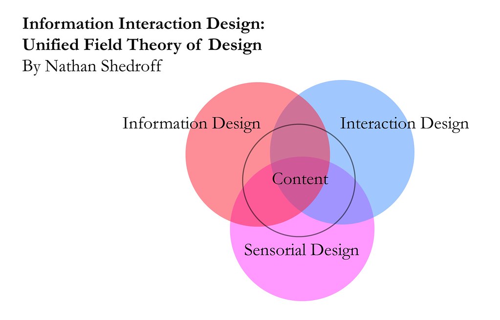
Nathan Shedroff offers a valuable unified theory of design that brings together information, interaction, and sensorial design. This theory is based on the premise that leveraging existing and creating new ways to organize and present data and information is a process that is roughly the same across media.

The intent of this theory is to enable people to create “valuable, compelling, and empowering information and experiences for others.” (Shedroff believes that these design skill are crucial for success in modern society.) In order to create these experiences people need to have a message and a reason for communicating it

The relationship between information, interaction and sensorial design disciplines is visualized as a Venn diagram. Each discipline encompasses different types of expertise. To create compelling content and engaging experiences designers need to bring to bear skills from all of these realms.

I classify this theory as an experience design framework because it brings together all disciplines required to created compelling communications and engaging experiences. Nathan has developed other valuable experience design-focused frameworks that I will explore in future posts.

First off, I’ll provide and overview of Shedroff’s definition for information, interaction, and sensorial design. Then I’ll delve deeper into each of these disciplines to explore relevant concepts and frameworks.

Overview of Information, Interaction, and Sensorial Design
  • “Information design addresses the organization and presentation of data: its transformation into valuable, meaningful information.” Information design has been practiced by graphic designers and publishers for a long time, though they rarely identified these practices as a distinct discipline. Recently this discipline has become more importance due to the proliferation of data, and the need to synthesize this data into information, knowledge, and ultimately wisdom.
  • Interaction design is “essentially story-creating and telling, [that] is both an ancient art and a new technology.” Interaction design for many traditional media such as print, TV and outdoor is limited and guided by existing conventions. Interaction design has long been practiced by industrial designers and live performers, though they did not identify it as its own discipline. The new possibilities for interaction offered by interactive technologies have increased the importance of interaction design.
  • “Sensorial design is simply the employment of all techniques with which we communicate to others through our senses.” This includes writing, visual techniques (e.g. graphic design, animations, and videography), sounds, smells, tactile feel (e.g. industrial design, and material selection). Sensorial design disciplines have their own histories, concerns and practices. The traditional focus of most design disciplines is on sensorial design. That said, most great designers had an understanding regarding information and interaction design, even if they did not recognize these practices as distinct disciplines.
Information Design
“An understanding of information design starts with the essential view that the vast amount of things that bombard our senses everyday are not pieces of information but merely data.” To transform data into information it needs to be organized, and presented in an appropriate context that can give it meaning. Information can be consumed via experiences that generate knowledge. Experiences can then eventually generate wisdom.

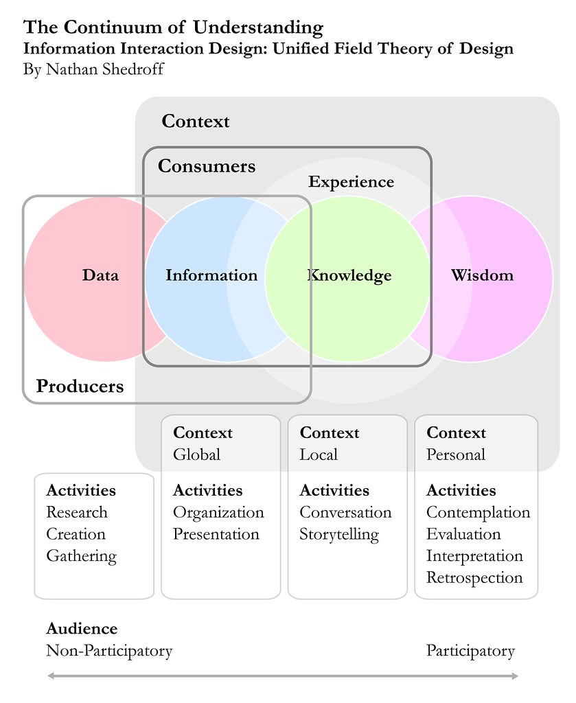
The Continuum of Understanding
Data and information are both part of a continuum of understanding. This continuum maps the relationship between four different levels of understanding: data, information, knowledge, and wisdom.


Data represents the lowest level of understanding along this continuum. It is the “raw material we find or create” to build our communications. By itself data does not contain a complete message and is inconsequential and boring. For these reasons data is mostly useful to people who produce content.

Data is transformed into information when it is organized and presented in a context that makes relationships and patterns visible and delivers meaning. Producers of information determine what data is used guided by their own goals and conceptual models. On the other hand, consumers determine how the information is consumed and evaluated according to their own goals and mental models.

The next ladder up on the continuum is knowledge. Knowledge refers to the understanding that we gain through experience. It is created by the integration of information with our existing mental models and understandings. Knowledge is participatory level of communication that can be individual or shared. As such, it can only be communicated through compelling interactions that enable people to identify patterns and meanings in information.

The highest, most intimate and vague level of understanding is Wisdom. Less is known about it than any other level, other than it is more abstract and philosophical. “Wisdom is a kind of ‘meta-knowledge’ of processes and relationships gained through experiences. It is the result of contemplation, evaluation, retrospection, and interpretation – all of which are particularly personal processes.” Unlike knowledge, wisdom is hard to share, and occurs at an individual level only.

Organization, Metaphors and Goals
Organization is the first step in the process of transforming data into information, so that it can be communicated effectively. This is a crucial activity because the organization of data impacts the way information is understood and interpreted by others. Shedroff identifies several common ways to organize information: Alphabets, Locations, Time, Continuums, Numbers, Categories, Randomness, Advanced Organizations, and Multiple Organizations.

Metaphors can also help transform data into information because they can enable people to quickly understand relationships and meanings. That said, when metaphors are used poorly (as they often are) they can worsen the user experience and limit the possibilities for progress associated to the design of information, interactions and senses.

Definition of objectives and messages is a crucial strategic step in the development of effective communications. All design decisions should be guided by pre-defined goals and messaging considerations.

Interaction Design
Interaction design is focused on the creation of experiences that are appropriate, effective, delightful, and even wonderful. Traditionally, the design of interactions has been practiced mostly in the performing arts such through disciplines such as script-writing, storytelling, performance, and instructional design. More recently, interaction design has become a key practice associated to the development of computer-based products and services.

Continuum of Interactivity
Nathan offers an interesting perspective on interactivity: “One way to consider the meaning of interactivity is to envision all experiences (and products) as inhabiting a continuum of interactivity.” This continuum ranges from passive experiences to interactive ones. There are six main attributes that can differentiate interactive experiences from passive ones. Interactive experiences offer the user with clear feedback, enhanced control, and additional opportunities for creativity, productivity, communication, or adaptability.


Feedback and control are closely related. All experiences with high interactivity provide high levels of feedback and a minimum level of control. Feedback enables the person interacting with a device to perceive (and hopefully understand) the impact of their actions. Control enables that same person to carry out actions on, and through, the device.

Creativity and productivity are two attributes of interactivity that are related to making, doing, and sharing things. Highly interactive experiences are better able to support creativity and productivity than passive ones. For example, guitar lessons available on the new Garage Band are more effective educational tools than those available via most books because they are more interactive.

Communication is an attribute of interactivity that is focused on enabling people to meet people, talk to others and share opinions and stories. By definition, experiences that support communication provide a high-level of feedback and control.

Adaptivity is the final attribute of interactivity explored by Shedroff. It is related to the adaptation of a system in response to changes in user behavior or context. Highly interactive experiences often provide features such as agents and additional tools and functionality based on user behavior or context. For example, video games get harder as the player gets better and progresses through different phases and reaches new milestones.

To help visualize different activities across these various attributes of interactivity, Shedroff developed an experience cube (a simplified version of a six-sided diagram that was originally attempted). This cube maps feedback and control as a single dimension, next creativity, productivity and communication are grouped as another dimension, adaptivity remains its own dimension. Any experience, whether computer mediated or not, can be mapped within this cube.

Sensorial Design
Sensorial design encompasses all disciplines related to the creation and presentation of media – graphic design, sound design, photography, animation, calligraphy, typography, cinematography, illustration, etc. This includes any design endeavor associated to the purposeful stimulation of the senses: tactile, visual, olfactory, or auditory. All of these disciplines share a few common concerns: a focus on understanding human senses; and a concern with the appropriate use of media, style, and technique.

[This information is sourced from a paper by Nathan Shedroff titled: Information Interaction Design: A Unified Field Theory of Design ]

Thursday, April 30, 2009

ID FMP: Distributed Cognition Models

Distributed cognition models conceptualize cognitive phenomena as happening across multiple individuals, objects, and internal and external representations of knowledge.  In contrast to the Information Processing Model, which is only focused on activities that happen inside the head, this model focuses on internal and external activities and encompasses External Cognitive Processes and Coordination Mechanisms described in my previous posts.

In comparison to these three frameworks, distributed cognition models provide more precise descriptions of internal and external cognitive activities. They are less abstract because their domain is limited to cognitive activities associated to specific contexts (e.g. piloting an airplane, doing taxes).

The three frameworks previously mentioned provide general descriptions of how human cognition works across all contexts. Their focus is on defining general laws that describe how our brain processes information and leverages the external world to enhance our cognitive capabilities. The distributed cognition model offers a phenomenological perspective that explores cognition as an embodied activity that takes place in specific physical and social contexts.

For example, a distributed cognition model that describes the activities that take place at an agency during creative development would differ considerably from that of a law office. They would feature many commonalities but the important thing is that the differences matter.

This perspective is important because designers need to understand how their product or service will actually fit into people’s day-to-day life. The insights that can be gleaned from the Information Processing and External Cognitive Activities Frameworks do not provide this type of understanding.  Distributed cognition models focuses on mapping these mundane day-to-day activities. They provide insight into how people actually make and share meaning and decisions within specific contexts.

A distributed cognition analysis is usually carried out as the basis for development of a distributed cognition model. Here is an overview of the main areas of examination in these types of analysis. As an example (and to work my brain just a little bit) I’ve carried out a high-level analysis of the distributed cognitive activities that take place at an advertising agency.
  • How does distributed problem solving take place? How do people work together to solve problems? In an agency environment, tasks are distributed across several departments with specific areas of expertise (e.g. client services, account & strategic planning, media, production, creative and traffic). People work together by coordinating their actions using documents (such as schedules, briefs, spec sheets and emails), events (such as meetings, phone calls, and presentations), and shared work practices (such as common vocabularies, understandings, and culture).
  • What ways does communication take place throughout the collaborative process and how is knowledge shared and accessed? Does it change as the activity progresses? Communications take place via meetings, emails and document artifacts such as presentations, briefs, schedules, conference reports, creative comps and spec sheets. The most important information is documented to facilitate sharing. Many of the document artifacts evolve as the activities progress. For example, a creative brief may be updated to reflect changes in strategy. The creative comps also change via multiple rounds of client reviews.
  • What is the role of verbal and non-verbal communication? What types of things are said or implied? Verbal communication is the primary type of communication associated to the management of projects (and communication associated to those projects). Non-verbal communication plays a fundamental important in the activities of the project itself. Layout design, videos, images, graphs, and even experiences are be used to brief creative teams regarding products or brands, and in client and internal presentations. The final creative product delivered by Agencies also employs both verbal and non-verbal communication. To elicit emotional responses from people agencies use non-verbal tools such as images, visuals, videos, sounds, interactions online, and more. In agency communication is often reinforced through by verbal and non-verbal communication.
  • What coordinating mechanisms are used? What are the rules and procedures that govern the workflow? There are several important coordination mechanisms that are used in an agency. These mechanism leverage external representations of knowledge such as schedules, job jackets, spec sheets, readers, status reports, conference reports, emails, calendars, scopes of work, etc. They also include meetings such as internal and client reviews, status meetings, and production kick-offs. Many rules and procedures are outlined in the agency’s process manual. These processes govern how work flows through the agency.
[source: Interaction Design: Beyond Human-Computer Interaction, page 129.]

** What the hell is ID FMP? **

Wednesday, April 22, 2009

Chapter 5 Homework: What is Interaction Design

This assignment was taken from the fifth chapter of the book Interaction Design: Beyond Human-Computer Interactions, written by Helen Sharp, Jenny Preece, and Yvonne Rogers.

Assignment Questions
This assignment requires you to write a critique of the persuasive impact of a virtual agent by considering what it would take for a virtual agent to be believable, trustworthy, and convincing.

Question A: Look at a website that has a virtual assistant, e.g. Anna at Ikea or one of the case studies featured by the Digital Animations Group (DAG) at http://www.dagroupplc.com, who specialize in developing a variety of online agents, and answer the following:
  • What does the virtual agent do?
  • What type of agent is it?
  • Does it elicit an emotional response from you? If so, what kind?
  • What kind of personality does it have?
  • How is this expressed?
  • What kinds of behavior does it exhibit?
  • What are its facial expressions like?
  • What is its appearance like? Is it realistic or cartoon-like?
  • Where does it appear on the screen?
  • How does it communicate with the user (text or speech)?
  • Is the level of discourse patronizing or at right level?
  • Is the agent helpful in guiding the user towards making a purchase or finding out something?
  • Is it too pushy?
  • What gender is it? Do you think this makes sense?
  • Would you trust the agent to the extent that you would be happy to buy a product from it or follow it guidance? If not, why not?
  • What else would it take to make the agent persuasive?
Question B: Next look at an equivalent website that does not include an agent but is based on a conceptual model of browsing, e.g. Amazon.com. How does it compare with the agent-based site you have just looked at?
  • Is it easy to find information?
  • What kind of mechanism does the site use to make recommendations and guide the user in making a purchase or finding out information?
  • Is any kind of personalization used at the interface to make the user feel welcome or special?
  • Would the site be improved by having an agent? Explain your reasons either way.
Question C: Finally, discuss which site you would trust most and give your reasons for this.

Assignment Answers

Question A
Site selected: ikea.com 

What does the virtual agent do?
The virtual agent inhabits a pop-up window and is comprised of an avatar of a young blond woman who blinks and moves here head. The interface is primarily text-based, both input and output are provided in this format. The output can be enhanced with audio that sounds computer generated.

The primary function of the virtual agent is to provide help to visitors on the Ikea website. This help encompasses supporting users in all aspect of their shopping experience (it provides essentially a new interface for users to interact with the site). The agent provides support by enabling users to search for answers to common customer service queries using natural-language questions. These questions are posed through a text box. The response is provided via text and, optionally, audio (audio is available on the UK site but no on the US site). When appropriate the agent will load a relevant page on the main screen of the browser.

What type of agent is it?
The agent is a customer service representative. It is a friendly female avatar that offers a stylized representation of a human female that does not attempt to provide a realistic image of a female Ikea employee.

Does it elicit an emotional response from you? If so, what kind?
I must be upfront about my general dislike for avatar-based interfaces, with the notable exception of videogames. I often feel as though I am being patronized when I interact with an agent on a website, the Ikea agent was no exception. One of the few online agents that I found successful was Ms. Dewey [http://en.wikipedia.org/wiki/Ms._Dewey], a search-engine prototype developed by Microsoft. I can understand why it did not scale but it was pretty damn cool.

What kind of personality does it have? How is this expressed? What are its facial expressions like?
The agent has a friendly and relaxed personality. This is expressed through her facial expressions and the movement of her head. The agent is smiling all the while she opens and closes her mouth. Her large eyes blink at a natural while pace while she moves her head from side to side in a relaxed manner.

Where does it appear on the screen? What is its appearance like? Is it realistic or cartoon-like? What kinds of behavior does it exhibit?
The agent is situated in a pop-up window. Its appearance is stylized and cartoon-like. Her behavior seems for the most part fluid and natural until she responds with audio and her lips do not move. The computer-generated voice that is used only detracts from the experience because it is cold and is neither cartoon-like nor human sounding.

How does it communicate with the user (text or speech)?
The agent accepts questions via text input and is able to provide response via text and audio output.

Is the agent helpful in guiding the user towards making a purchase or finding out something? Is the level of discourse patronizing or at right level? Is it too pushy?
The Ikea agent can be helpful in guiding users towards making a purchase, or finding a product or retail location. One of the strongest features of the Ikea agent was its ability to load content that is relevant to the user’s query onto the main browser window. For example, when I searched computer desk it took me to the Ikea website’s computer solutions category.

Though I find agent-based interfaces patronizing in general, this one is much less so than most. The agent provides straightforward and short answers coupled with additional information on the main browser window. I actually found this agent to be useful, a fact that helped me overcome my initial aversion to this type of interface.

What gender is it? Do you think this makes sense?
The agent is a female. I think this makes sense largely based on my assumption that Ikea online shoppers are mostly women. I suspect that most men also prefer to deal with a female agent – especially since even the shiest guy would not be intimidated by an online agent. In the US there is a tradition of portraying customer service representatives as friendly females with a girl next door look.

Would you trust the agent to the extent that you would be happy to buy a product from it or follow it guidance? If not, why not?
I would trust the Ikea agent because she is informative, helpful and non-intrusive – she never initiates interaction with the user. The Ikea agent helps shoppers to find things and get answers to frequently asked questions regarding store and website policies.

What else would it take to make the agent persuasive?
Though I did find the agent useful, there are several things that can be done to improve its persuasiveness: improve interaction and visual design; enhance functionality; and upgrade audio interface.

Improve interaction and visual design: from an interaction standpoint the conversation with the agent should be recorded in a manner that enables the shopper to scan the queries and responses in search of answers (or a new chair). The look and feel of the agent should be upgraded to better reflect the design sense of the Ikea brand. Additional details should be added to enhance the enjoyment of users (e.g. have the rep read a book while she is waiting for the user). Since many shoppers like to go back and forth when they shop, the agent should help the user find products that they’ve looked at during their visit to the website.

Enhance functionality: additional functionality that could enhance the agent’s usefulness includes the ability to provide tips regarding other Ikea products that match pieces of furniture being viewed by the shopper. These recommendations should be provided in a non-intrusive manner.

Upgrade audio: The last thing that I would change is to upgrade the audio quality. This was one feature that I found to be very poor. Currently, the agent “speaks” in a computer-generated voice with a slight British accent. For the US version of the agent they should consider adding sound functionality, as if it is done right it can add to the user’s interactions with the agent.

Question B
Site selected: cb2.com (US furniture retailer akin to Ikea)

Is it easy to find information?
The cb2 website is pretty well organized, which makes it easy for the user to find information. Aside from the standard categorization of products by furniture type and context, they also provide lists of new and most popular products. These elements of the site help people find products through browsing. The search feature provides users with a way to shortcut the browsing process in an attempt to find a more direct route to the information they seek.

What kind of mechanism does the site use to make recommendations and guide the user in making a purchase or finding out information?
The CB2 site actual does a better job at making recommendations, though it is only equally effective at guiding users to find information regarding products, and features less compelling interactive guides. From a recommendation standpoint, the CB2 site provides shoppers with tips on other products that work with any piece that is being viewed. Though both sites differ in the way they categorize their product offerings, from a findability standpoint both the CB2 site and the Ikea site (including the agent and general information architecture) are equally effective.

Is any kind of personalization used at the interface to make the user feel welcome or special?
The CB2 site does not offer any personalization. Shopper’s are not asked to register and log-in during their visits to access special recommendations or offers. The Ikea site does provide a log-in feature, however, it has been down since I have been working on this assignment.

Would the site be improved by having an agent? Explain your reasons either way.
I don’t think an agent would have a big impact on the experience at CB2. The reason being, content on the site was easy to browse and find without the help of an agent. I believe that an agent would only improve the experience of a very small segment of the shoppers on the site. If voice-based interaction becomes more common on computers then there would be value in adding an agent to the CB2 experience. This is not an unlikely phenomenon considering that many applications now-a-days are striving to become voice-enabled to facilitate use via mobile phones (check out the new google search on iPhone and Android, cool stuff).

Question C

Finally, discuss which site you would trust most and give your reasons for this.
Both experiences were on par for one main reason: on the Ikea website the agent provides users with a supplementary interface that does not replace the traditional browsing paradigm on which the rest of the site is built. The Ikea and CB2 websites both provide well-designed information architectures that make information and products easy to find. Also, both companies have strong and respected brands that stand for modern and affordable design. I guess I have officially copped out of answering this question.

** What the hell is ID-BOOK ? **

Thursday, March 12, 2009

ID FMP: Useful Definitions (a living post)

As I embark on my exploration of frameworks, models, and principles related to interaction and experience design I will maintain this working list of definitions regarding key terms and concepts.

This is by no means a comprehensive list. This is actually an utterly selfish endeavor as these definitions are solely intended to help me in my own study of this field. They have been cherry-picked, mostly from online sources and the book Universal Principles of Design.

Augmented Reality: "Augmented reality means that I have some mediating artifact that provides me with a visual overlay on the world. This could be a phone, it could be a windshield, it could be a pair of glasses or contact lenses, doesn’t matter. And you’re going to use that overlay to superimpose some order of information about the world and the objects in it onto the things that enter my field of vision – onto what I see." [source: Adam Greenfield, from interview by Tish Shute]
  • Marker-Based: "Marker-based AR implies that there’s some reasonably strong relationship between the information superimposed over a given object, and the object itself. That object is an onto, a spime, it’s been provided with a passive RFID tag or an active transmitter. And it’s radiating information about itself that I’m grabbing, perhaps cross-referencing against other sources of information, and superimposing over the field of vision. Fine and dandy."
  • Markerless: But there’s another way of achieving the same end, right? Instead of looking at a suit jacket on a rack and having its onboard tag tell you directly that it’s a Helmut Lang, style number such-and-such from men’s Spring/Summer collection 2011, Size 42 Regular in Color Gunmetal, produced at Joint Venture Factory #4 in Cholon City, Vietnam, and packed for shipment on September 3, 2010, you’re going to run some kind of pattern-matching query on it. And without the necessity of that object being tagged physically in any way, you’re going to have access to information about it. 
Cognition: “of, relating to, being, or involving conscious intellectual activity (as thinking, reasoning, or remembering)” [source: Merriam-Webster] ; “a faculty for the processing of information, applying knowledge, and changing preferences.” [source: Wikipedia]

Framework: "A basic conceptual structure used to solve or address complex issues. This very broad definition has allowed the term to be used as a buzzword, especially in a software context." [source: Wikipedia]

Interference Effects: "A phenomenon in which mental processing is made slower and less accurate by competing mental processes." [source: Universal Design Principles]; an example of an artifact that would generate this effect is a green stop sign.

Mapping: "A relationship between controls and their movements or effects. Good mapping between controls and their effects results in greater ease of use." [source: Universal Design Principles]

Model
: "A hypothetical description of a complex entity or process; representation of something, sometimes on a smaller scale" [source: Princenton Wordnet]
  • Mental model: "Representations of systems and environments derived from experience." [source: Universal Design Principles]; "An explanation of someone's thought process for how something works in the real world.” [source: Wikipedia]; “a mental representation that people use to organize their experience about themselves, others, the environment, and the things with which they interact; its functional role is to provide predictive and explanatory power for understanding these phenomena” [source: Virginia Tech]
  • Conceptual model: “an abstraction, representation and ordering of phenomena using the mind.” [source: Charles Darwin University]; “conceptual model represents 'concepts' (entities) and relationships between them.” [source: Wikipedia]

Principle: "A basic generalization that is accepted as true and that can be used as a basis for reasoning or conduct; a rule or law concerning a natural phenomenon or the function of a complex system." [source: Princenton Wordnet]

Scaling Fallacy
: "A tendency to assume that a system that works at one scale will also work at a smaller or larger scale." [source: Universal Design Principles]

Serial Position Effects: "A phenomenon of memory in which items presented at the beginning and end of a list are more likely to be recalled than items in the middle of a list." [source: Universal Design Principles]

System: "a group of independent but interrelated elements comprising a unified whole; 'a vast system of production and distribution and consumption keep the country going.'" [source: Princenton Wordnet]; "System (from Latin systēma, in turn from Greek systēma) is a set of interacting or interdependent entities, real or abstract, forming an integrated whole." [source: Wikipedia]
  • Product and Service Systems: the independent but interrelated elements through which a users experiences a product or service. These systems encompass the product or service itself and indirect elements such as manuals, user groups, and communities. To that extent, a product or service system can vary significantly depending on context of use since these external elements often play an important role inthe user experience or a product or service.
  • System Image: As used by Don Norman, refers to the overall interface available for a user to interact with a product or service system including both direct and indirect elements. Direct elements of the interface include the product or service itself. Indirect elements encompass things such as instructional manuals, user groups, and communities. [source: me]
** What the hell is ID FMP? **

Sunday, March 8, 2009

Interaction Design Frameworks, Models and Principles (ID FMP)

Since I began my interaction and experience design curriculum six months ago I've come across a large number of frameworks, models and principles that provide guidance and insights to designers. These tools were developed by designers, psychologists, sociologists, and anthropologists who have long been exploring the ways in which people interact with products, with each other, with organizations, and with the world at large.

To help me keep track of all these useful tools I will start writing posts that provide a description of these individual frameworks, models or principles. I will also include source information and, when possible, list additional information sources. All of my posts related to this series will be tagged with ID FMP.

The frameworks, models and principles that I will cover span many different perspectives and domains. Some are user-focused while others center on design-related concerns; several provide general guidance for designers while others focus on considerations that are relevant to specific niches only. The common thread that holds these tools together is their applicability to the design of interactions and experiences.

Tuesday, March 3, 2009

Product Concept: Cyber Cat Heating Pad

Having read the first two chapters of my interaction design textbook, I decided to begin applying the frameworks that I've learned to the numerous product ideas that float around in my head all the time. These ideas will vary in subject, scope, category, and seriousness (or rather silliness). My purpose here is not to develop commercially viable products but rather to explore and experiment with the stuff that I am learning. This is just the first of several of these explorations.

Product Description
:
A cat bed with a heating pad designed that is internet-enabled and able to sense and share information about the cat's presence and activities on the cat bed.

Goals & Requirements

Usabiliy Goals
  • The heating pad needs to be easy to set-up, and its standard functionality (e.g. turning on heat and setting heat levels) should be available without the need to set-up connection with internet application.
  • The online application should be simple enough to set-up without the need for a user manual. A set-up assistant (a.k.a. wizard), or limited functionality can be used to assist new users may be required to achieve this objective.
  • The cat bed should fit a window sill (9" wide) while still being able to accommodate an average sized cat comfortably (20" long).
  • The cat bed should to provide heat and a comfortable environment for the cat. The cat bed should leverage a comfortable fabric and the heat should be easily adjustable to support this objective.
  • The online application should provide advanced user the ability to customize their virtual connection to cat bed via visual, textual and sound displays. The display should be customizable on multiple levels, via templates for novices, via advanced preferences for intermediate users, and via API for advanced users (with programming/development experise).
  • System should leverage and interface that is memorable so that users can easily recognize how to carry out activities even after prolonged periods of inactivity.
  • System should protect users from common errors, such as accidental temperature changes (e.g. mistakenly turning off heating pad), and limit action for novices to simple activities related to data visualization.
Experience Goals:
  • Aesthetically Pleasing: what is the users initial response to the cat bed's appearance? Is it one of enjoyment, pleasure, or dislike?
  • Delightful: What is users users response to the presence awareness visualizations and alerts? Is it one of delight, surprise, enjoyment, or annoyance?
  • Rewarding: Does the user suspend disbelief to enable a remote connection to the cat on the bed? Is the user's connection experienced as rewarding, boring, cutesy, or frustrating?
  • Entertaining: In what ways does the user engage with the cat bed on an ongoing basis? Does s/he feel entertained, satisfied, safe, frustrated, or surprised?
The Conceptual Model

The metaphors and analogies: Most important metaphors and analogies that can help user understand what the product can be used for, and how to use it.

The metaphors:
  • The main metaphor is closeness, the idea of having your pet close to you wherever you go by receiving updates about their presence and activities on the cad bed.
  • Another metaphor is connection, the idea of being connected to your pet wherever you go by being able to respond to the cats presence in a way that impacts an aspect of the cad bed (e.g. temperature, light, sound).
  • Customization is also an important metaphor, the idea of being able to customize how the pet's presence is communicated and how your responses are made manifest by the cat bed.
The analogies:
  • The most obvious analogy is using a standard heating pad and cat bed.
  • Monitoring a home webcam is an useful analogy to describe the presence monitoring feature of the product.
  • Receiving email and text messages is an useful analogy for the presence alerts.
  • Setting preferences on web applications such as email clients, social networks, or feed readers is an useful anology for the simple customization features of the system.
  • Selecting templates is an analogy for the using pre-created set-of-preferences options that are developed based on wide range of themes.
The Concepts: Concepts that users are exposed to when using the product, including objects they manipulate, their attributes and actions that can be executed on (and with) them.

Physical Cat Bed and Related Concepts:
  • The comfort layer is made up of the outer fabric and soft stuffing that provide comfort and are durable.
  • The heating layer includes a safe heating solution that features remote temperature controls that override virtual controls.
  • The electronic layer includes the sensors and processors that enables presence awareness by supporting data collection and distribution via wireless connection.
  • The protection layer ensures that all elements are kept protect from the environment (including the cat).
Cat Bed Application and Related Concepts:
  • The communication module is the main user interface. It displays data visualization, alerts and controls. Data visualization includes real time presence monitoring, and over-time data infographics. Alerts include cat zen and standard updates via website (these can also be delivered via a widget on social networks, desktops and mobiles, emails, and SMS). The controls enable users to set the temperature of the cat bed, and activate light/laser or sound. Users can create own cat zen or use existing from other users and product developer.
  • The preference module allows users to input information about the pet and provides customization options for the communication module, widget, and alerts. Pet information includes such as name, birthday, attitude, likes, dislikes, and picture. Communication options include setting visualization and channel settings for real-time and over-time event updates related to pet's presence, position, movement, and duration. Multiple preference settings can saved as templates and shared with others.
  • The third module is the database. It captures data from the physical cat bed receives, stores the information in the database, makes it available through an API, and transmits it via built-in channels.
  • The last module is the API, which enables advanced users to develop extensions to the functionality. All cat bed sensors would be accessible via the API. Applications could be shared online.
The relationships and priorities: Define the relationships between the concepts, for instance whether an object contains another, and the prioritization of possible actions.

Relationships between concepts:
  • The cat bed is comprised of four related concepts described above, here is an overview of how they relate to one another: The comfort layer is connected to the electronic layer by the presence of sensors that enable the presence sensing. It is also adjacent to the heat layer, which is responsible for heating the comfort layer to provide a warm environment for the cat. The heating layer is connected to the electronic layer to enable the electronic layer to control the heat settings on the cat bed. A manual override on the cat bed itself ensures that heat settings can be changed directly from the cat bed. The protective layer encases the main components of the electronic layer and the bottom of the cat bed for protection purposes.
  • The application contains the four related concepts described above, here is an overview of how they relate to one another: the communication module, preferences, database and API. The preferences is part of the communication module. It enables users to customize the how the data captured from the cat bed is displayed via the application interface, widget or alert. The database holds the data and makes it available for existing application and new ones developed via API.
Action priorities for cat bed:
  • Priority of action for the cat bed: The bed should usable as a standard pet bed first and foremost; the next most important user action related to the bed is setting and controlling the temperature of the bed (manual temperature settings override application-based ones); this is followed by the ability to activate the electronic layer and link the cat bed to a computer via wireless connection.
Action priorities for communication module from application:
  • From a general use perspective, the most important actions afforded to users via the communication module are: (a) first, the ability to easily log-in to his/her pet information; (b) then comes the ability to toggle between real-time and over-time visualizations; (c) next up is the ability to change the visualization style for either real-time or over-time visualizations; (d) then comes the ability to communicate with the cat bed via sound, light or temperature; (e) which is followed by the ability to access the application preferences; (f) then the ability to give thumbs up or down to cat zen haikus; (g) followed by the ability to submit your own haikus; (h) sharing haikus via email, social networks or SMS is next on the action priority list.
  • From an initial set-up perspective here are the priorities: (a) to allow users to easily connect to their cat bed; (b) provide a wizard that allows users to get started quickly using predefined templates easily, without needing to access detailed preferences.
Action priorities for preferences module from application:
  • The most important action on the preferences module is setting up of pet information including name, birthday, attitude, likes, dislikes, and picture;
  • Next up are the preferences related to visualization which include in priority order: (a) setting of awareness preference (what events related to the cat's presence should act as triggers for visualization purposes?); (b) setting and saving channel preferences (what channels should be used for each communication triggered by an event?); (c) setting visualization preferences (how will the communication be presented in each channel?); (d) saving awareness and preference settings into templates that can be easily swapped from the communication module; (e) set cat wisdom preferences (Ability to activate or deactivate? Select haiku library, standard or user generated.); (f) saving cat wisdom preferences into templates; (g) share awareness, preference, and cat haiku templates with other users;
  • Last are the preferences related to data visualization beyond the application, including: (a) settings for widget-specific preferences; (b) settings for API preferences and authentication.
The Mappings: A description of how the concepts described above map to the user experience that the product is designed to create.
  • The design and construction of the bed will be guided by aesthetic, sustainability as well as comfort-related considerations. The look and feel of the artifact will be designed to be aesthetically pleasing; the materials and methods used for manufacturing each layer of the beds will be sustainable; the bed will be designed to be comfortable for the cat. These principles aim to provide aesthetically pleasing products on visual, ethical and emotional levels.
  • The visualizations provided by the application corresponds the different events associated to the cat's presence and activity on the cat bed. Using interesting visualization options to bring the pet's presence to life across physical distances, using both reminders and contextual awareness, will serve to provide delight to users throughout their day.
  • The controls provided by the application correspond to actions that the user can take to impact the environment of the cat bed. Users will be able to choose between multiple possible actions. These action include but not are limited to the following list: generating a sound, activating a light, changing temperature, activating a webcam. These features aim to provide the user with an interactive experience that is rewarding.
  • Caring details, such as the cat haiku, and the open API enable the user to interact with the data generated by the cat bed in innovative ways. These features are provided to enable the user to connect with their pet in an entertaining way.
A Family of Products
Here are some ether ideas for my fun, and utterly silly, ideas for cyber cat products: the cyber scratching post, and fuzz ball playing field. More to come on these (maybe).

Thursday, February 12, 2009

10-15 Week Self-Taught Interaction Design Course

For the next 10-15 weeks the content of my blog is going to be associated to my reading of the text book Interaction Design: Beyond Human-Computer Interaction. This book was written by three British ladies, Sharp, Rogers and Preece, and published on Willey. Here is a link to their website, which is somewhat underwhelming considering the depth of the book. This is not to say that other topics may not occasionally pop up - the will be the exception rather than the rule.

For the past five months my personal curriculum has focused on reading and applying the theoretical knowledge and perspectives in my everyday experience with interactive devices and services. Moving forward I want to take a more structured approach to exploring interaction design before I delve into experimentation with design itself (those who would rather just dive in head first into the practice of design itself may think this sounds like looking at a porno magazine - albeit a good one - in substitution for the real thing).

So for the next few months my posts are going to feature my "homework". I will be sharing the assignments that I will be completing from the end of each chapter in the text book. Here is an overview of what the book covers (of course, I will likely focus on some areas and assignments, while glossing over others - one of the main benefit of following your own curriculum):
  1. What is Interaction Design?
  2. Understanding and Conceptualizing Interaction
  3. Understading Users
  4. Designing for Collaboration and Communication
  5. Affective Aspects
  6. Interfaces and Interactions
  7. Data Gathering
  8. Data Analysis, Interpretation, and Presentation
  9. The Process of Interaction Design
  10. Identifying Needs and Establishing Requirements
  11. Design, Prototype, and Construction
  12. Introducing Evaluation
  13. An Evaluation Framework
  14. Usability Testing and Field Studies
  15. Analytical Evaluation

Saturday, December 27, 2008

Book Summary: Making Meaning – How Successful Businesses Deliver Meaningful Experiences

Summary of book written By Steve Diller, Nathan Shedroff, Darrel Rhea

This book has valuable ideas regarding how to drive innovation in today’s experience economy. It was written by a group of experts from the field of experience design who have strong ties to Cheskin, a strategic design consulting and market research firm with a focus on helping companies to develop meaningful innovations. The concepts and framework presented here reflect the thinking and approach that were developed, and are currently used, at this leading design research firm.

Many of these ideas have been communicated via blogs and articles published over the past couple of years. The value of the book, in comparison to the content that you will find online and in magazines, is that it has enabled the authors to explore these ideas in greater depth. Here they are able to provide additional background and contextual information in defense of their perspectives, as well as a more in-depth description of the frameworks and methodologies they have developed to help their companies and clients succeed. At only 140 pages, this book is a fast and enjoyable read that is clear and easy to follow.

The guiding premise for this book is that “consumers increasingly make their purchasing decisions based on deeply valued meanings that companies evoke for them through their products and services… as opposed to simply responding based on features, price, brand identity, and emotional pitches.” In other words, we have entered an era of meaningful consumption. This new world is framed by the rise of globalization, the end of the mass market, and the empowerment of individuals. To succeed organizations can no longer innovate for the sake of novelty, they must focus their innovations on addressing the human need for meaning.

Once this initial premise is laid out, the authors shift their focus to mapping out the evolution of consumer demand in Western society. Next they define the concepts of experience and meaning, to provide a foundation for the second half of the book where they focus on the creation of meaningful experiences. During this section they explore how to find opportunities for meaning, and how to design and deliver meaningful experiences. Below I’ve included a more in-depth overview each of these sections.

Brief Evolution of Consumer Demand

From 1900 through the middle of the century most innovation was product-based, focused on price and feature improvements. With the rise of the assembly line and growth of distribution infrastructure, companies were able to produce products with new features (e.g. soap varieties, car colors, etc.) A “build it and they will come mentality” ruled the day.

In 1950 a brand-focused approach to innovation began to take hold. This shift in perspective became more prevalent as companies realized that serving a single market segment with specific needs and desires was a strategy for uccess. In this period the driving force of innovation evolved from product “features” to “benefits”, which can be physical, emotional, identity-focused or social.

More recently, as the branding has evolved to encompass all customer touch points, the focus of innovation has shifted to the creation of experiences. This brings us back to the premise of this book: to succeed in this market, organizations must base their innovations on delivering “meaning” rather than “benefits”.

Definition of Experience and Meaning

At the most basic level experience can be defined as a “sensation of change.” However, from a business and design perspective, “experience” refers to engagements that are created by consistent and coordinated systems of interactions, or “touch points’, that are designed to convey a specific brand characteristics or attributes.

The focus on creation of experiences “reflects a company’s effort to be consistent in its value proposition and its expression in every connection with a consumer.” That said, consistency is not sufficient to make an experience relevant, compelling, and valuable. Experiences must deliver meaning.

The definition of meaning used in this book refers to “connotation, worth, or import”. Here is a personal example: “going to music concerts is meaningful to me because it gives me a sense of beauty.” From this quote you can tell that I appreciate concerts because they inspire me by delivering pleasures to my senses.

Meaning is central to our experience of reality. It is created on a personal- and community-level and serves as the foundation for our understanding and actions. Going back to experiences, they enable companies to “evoke” meaning since they are not able to actually create meaning, which only arises in their customers’ minds.

Fifteen different “meanings” have been identified as being the most universally valued according to the fieldwork carried out by the authors. Here they are in alphabetical order: Accomplishment; Beauty; Creation; Community; Duty; Enlightenment; Freedom; Harmony; Justice; Oneness; Redemption; Security; Truth; Validation; Wonder.

The Starting Point

To deliver meaning, companies need to reverse their development process to start with an understanding of their customers, and what their customers’ find meaningful. The first steps on this path are for an organization to identify their innovation culture, and put together a team to drive change.

A company’s innovation culture ultimately drives its innovation process and rate of change. There are three different types of cultures explored in this book: Structured, Creative, and Dynamic.

Regardless of culture, companies need to leverage interdisciplinary teams to successfully create experiences that are meaningful “because [this] heightens the likelihood that all customer touch points of the experience will be cohesive and consistent.” Here is a list of the core participants that should be involved in innovation initiatives: Brand Management; Sales Management; Marketing Management and Research; Design; Development/Production; Information Technology; Human Resources; Operations; and CEOs. As with any team, a lead decision maker needs to be identified from one of these areas of expertise.

Design Principles and Process

To deliver meaningful experiences, companies need expand the role of design from viewing it as a function that is limited to visual representation and adornments to embracing it conceptually as a process across all disciplines.

The conceptual role design should play to drive the development of meaningful experiences should be driven by seven principles:
  1. Design creates corporate value
  2. Design is pervasive
  3. Design is collaborative
  4. Design includes execution
  5. Design is a transparent, knowable process
  6. Design is iterative
  7. Design includes both short-term and long-term goals.
These design principles reflect a philosophy that views design as a process that can be broken down into five distinct phases:
  1. Identifying the Opportunity for Meaning
  2. Framing the Experience
  3. Shaping the Concept
  4. Refining the Experience
  5. Expressing the Experience

The Process in More Detail

1) Identifying the Opportunity for Meaning: during this phase companies learn about the competitive landscape, market size, important trends and technologies, distribution channels, and customer lifestyles, preferences and needs. Key activities include defining the market and understanding the customer. Various types of primary and secondary research are needed to unearth these insights.

2) Framing the Experience: during this phase companies choose the audience segment on which to focus, identify the experiences they will create, and define the meaning the experience should deliver to customers (e.g. the scope of the experience) including articulating the value form functional, economic, emotional and identity perspectives. Key activities include choosing the experience and creating an experience framework to define the scope of the experience.

3) Shaping the Concept: during this phase companies think through all necessary elements that will enable them to deliver a consistent and meaningful experience and avoid the most common pitfalls, which include errors of omission and conflicts of interest. Key activities include defining the breadth of expression, duration of experience, and intensity of experience.
  • From a breadth perspective, companies need to identify which components to leverage (most common components include product, service, brand, channel, promotion, marketing communications, customer support, and alliances)
  • Companies then need to think through how these various components will be integrated during the various phases of the experience to deliver meaning: initiation, immersion, conclusion and continuation.
  • Next companies need to identify the intensity of the connection a consumer will have with the experience. There are three separate levels of intensity, from weakest to strongest, reflexive, habitual and engagement.
4) Refining the Experience: during this phase companies fine-tune the experience being created by customizing characteristics of interactivity such as user control, adaptability, feedback and communication; and by designing the triggers of the experience including language, symbols, and sensations. Key activities include exploration of interactivity and definition of aesthetic details.

5) Expressing the experience: during this final phase of the design process companies produce and deliver the experience. Unlike the linear processes associated to assembly-line businesses, experience-based companies are in a perpetual state of production and need to maintain the appropriate mindset to support this reality.

Relevant Links
Here are links to the websites and blogs from the authors from this book. I specifically want to highlight Nathan's website because it has a wealth of resources related to interaction and experience design including lists of books, articles, blogs and courses. I have used these resources extensively in developing my personal curriculum.

Wednesday, December 10, 2008

Design Trends from Frog Design [Trendforum 2008]

Last week I came across a presentation from Frog Design about design trends. There were several ideas about the evolving nature of design that sparked my thinking (and considerable interest). First let me share with you highlights from the presentation first, then I will elaborate on my own thoughts.

Highlights from Frog Design Presentation
  • We are moving towards a design democracy: transition from mass consumption to mass customization. People are starting to take design into their own hands, enabled by technology. People are participating in the design of their own lives within a world that is "always on" for conversation and self-expression.
  • Designers beware of becoming an enemy of design: A shift in design mindset is happening from designing "for" to designing "with" people. This, of course, requires increased focus on understanding the people who will use the product. It also points to the opportunity for designers to focus on the creation of tools rather than final products - tools then enable users to make their own creation.
  • The system is the product. People are buying what the system means to them - e.g. what it enables them to accomplish - rather than the products/tools themselves. The system to which I refer here is comprised by the actual products that function as tools - Think iPod and lego.

Thoughts Sparked by the Presentation

Technology is no longer just a tool. It has expanded its domain over numerous aspects of our lives - personal, social, professional, expressive, etc. Our ability to leverage technology to customize products, and to customize technology itself, has is driving force in this evolution. The increasingly pervasive role that technology plays as a medium, "through" which we act, has led to an increased focus on it as an object of interaction itself, "on" which we act.

The malleability of modern day computation-based technologies has greatly increased the need for design. Design with a capital "D" (the formal practice of design as embodied by professional designers) has received a lot of attention and is being applied to many new areas for business and social purposes. design with a small "d" (design thinking and behavior that is a core element of human beings) has been impacted in an even more interesting manner. People have become increasingly conscious of their ability to design their own lives.

My perspective is based on my personal experience - hence, it is most definitely biased. I have a high-level of comfort with technology and have often used it as a tool to support my pursuits. Technology definitely plays an important role in enabling me to design my life - it is a medium through which I express my identity, a place where I converse with other people and a tool for me to complete various tasks. I am both technology literate and design literate. We can't forget that our current education system is not designed to support design and technology literacy. There is a need for a concerted effort to educate people how to make sense of, and act in, this new world.

An important question to consider: how can we support literacy in the realms of technology and design? There are some schools that are exploring how to address these needs; the New Design High School is such a school in my own neighborhood. They have an innovative curriculum that is based on design principles (check out their website) [disclaimer: earlier this year I helped organize two fundraisers for their music production program]. Another approach is to address this challenge is through design itself. Focusing on designing ways to interact with technology that are more natural and social appropriate for new contexts and to lower the learning curve for inexperienced or under-served users.

Another question to investigate: how can designers understand how to create designs for technology that address human needs from emotional and social perspectives, rather than focus on usability? Brenda Laurel's on book design research has some interesting methods and perspectives aimed at helping designers better understand how to emotional and social needs. The chapter written by Nathan Shedroff is of special interest, he shares some very unconventional approaches to design research that are focused on these areas.


[via DesignMind]

Saturday, November 29, 2008

Gesture and Touch Based Interface: G-Speak from Oblong

Check out this new gesture- and touch-based interface that was developed by Oblong technologies. I came across this video on the Interaction Design Blog - as they rightfully state, this is the closest thing I've seen to the interface from Minority Report. The demo itself is pretty awesome. It showcases several cool features from this system, here is a quick overview of these elements:

Three-dimensional navigation that enables users to access content via an interface that can organize data within a three-dimensional environment. This enables users to "directly manipulate" data objects and quickly access to information. This is achieved because users are able to leverage their familiarity with physical space to navigate this virtual world.

This is not to say that users can just rely on their physical-world metaphors to successfully engage with this system. After all, computer-based metaphors always have an aspect of "magic" because the physical actions we carry out have meaning beyond their direct physical impact. Therefore, users will need to learn how to use their hands to pull, turn, push, select and act on objects within this virtual space.

Integration of physical and virtual spaces to enable users to interact seamlessly across multiple computers and screens within a given environment. This is a really cool feature that can enable an user to easily move files between computers and other devices, such as mobile phones. Better yet, users are still be able to manipulate the files using the same interface across any of the connect devices. Compare this to Microsoft's surface which enables users to drag a file on the screen so that it is added to a mobile device. However, in order to handle the file once it is on the mobile device, then the user needs to leverage the mobile-device specific interface.

One additional aspect of this physical-virtual integration is that it allows users to change the physical configuration of the system in order to impact the virtual configuration. This is illustrated in the video when the user rotates the "screen table". The data being displayed on the table rotates along with the physical movement of the table, except for the pointer which is being manipulated by the user. This pointer does not move because the users hold his hand stable to hold the pointer in place. Sounds like a small simple element but it adds a lot of possibilities to the interactions that can be supported by this system.

Collaborative interaction is enabled by the system's multi-user support. Therefore, several users can work simultaneously with the system. It is not clear whether different users can work on different types of tasks simultaneously within the same environment. One additional questions is if multi-task support is provided then what are the requirements and how would the behavior of the system change in order to support this type of usage.

The data interaction and visualization opportunities provided by systems of this type will likely enable humans to interact with increasingly complex and large data sets. I would love to see this system in action first hand. Until that is possible I will have to be content with this vide. Hope you enjoy it as well.


[via Interaction Design Blog]

Wednesday, November 26, 2008

Issue with Design of "Sharing & Permission" Functionality on MAC OS X Leopard

I am a die hard Apple fan who has been using Macs for over 11-years. Some of the features that I like most about Apple computers is that they are more reliable, less prone to errors, and easier to recover from errors than Window-based PCs - at least based on my personal experience as a regular user of both Macs and PCs. Overall, I find that Macs are better designed than PCs.

Earlier today I came across what I consider to be a major flaw in the design of Apple's Leopard operating system. This issues created the most frustrating experienced I've ever had with a Mac, yet I believe that it can be easily remedied in future OS updates. In this post I will even offer up some of suggestions for how Apple can solve this issue from a user interaction perspective.

What's the Issue
Let's start with the lesson I learned: if you are running Mac OS X Leopard then don't mess with the system's "sharing & permission" preferences for your start-up drive.

So here's what happened. Yesterday I was fixing the "sharing & permission" preferences for my computer's hard drive, which is also my start-up drive. To the right, I've attached an image of the info window where these preferences reside. I made sure that the preferences for "admin" and "everyone" were set-up properly; these were set to "read & write" and "write only (drop box)" respectively. In the process I also set-up the preference for the "system" to "write only (drop box)".

Little did I know that by changing the permission for the "system" I had created a situation where my computer would be unable to start-up. This became apparent this morning when I turned on my MacBook and the system became frozen while on the boot-up screen where the Apple logo appears above a small and round progress indicator.

Since I have a high-comfort level with, and decent working knowledge of my MacBook I suspected that the change I made to the "sharing & permission" preferences could be causing this issue. That said, when I called a local authorized Apple representative here in Brazil (where I am currently visiting my parents) the rep was quick to tell me that this was obviously an issue related to a corrupted hard drive and that I would need to re-install my operating system.

Before going down this painful route, I decided to first take an alternate approach to resolve this situation based on my initial hunch regarding the source of this problem. I rebooted my MacBook as a hard drive by connecting it via firewire to my sister's MacBook. Then I was able to change the system's "sharing & permission" preferences on my computer's hard drive back to its normal state of "read & write".

After having encountered this problem, I checked a pre-Leopard version of the Mac OS X and confirmed that it does not allow users to change the "sharing & permission" privileges of the system. This helps ensure that people did not encounter the problem with which I had to grapple this morning. Check out the sample image on the left. As you can see when "system" is selected the "access" privileges cannot be changed.

Fixing the Issue
There are many ways that this issue can be resolved from a user interaction/experience perspective. Here are some of my suggestions, hopefully Apple will be willing to take one of these to heart:
  • When users change the "sharing & permission" preferences for the system, the OS should prompt the user regarding the impact that this action will have; better yet, they should not allow the user to make this change unless they change the start-up drive configuration.
  • If the user has been able to change the system's "sharing & permission" privileges, then the computer should display an error message that explains the situation and ideally the system should also provide the user with the opportunity to change the access privileges to the drive in questions - using the necessary system admin password, of course.
  • In the near term, Apple should make sure that all of its employees are aware of this issue. When speaking to authorized Apple service reps I was informed that this issue was definitely a sign of issues with my hard drive - most likely a sign that the HD was corrupted.

Monday, November 24, 2008

Search Application Design for Flickr

I know that the ability to design custom search engines for Flickr has been around for several years. Many designers have played with this technology and many publications have written short features about these mash-ups. That said, I have not found a recent comprehensive list of the most interesting image search engines out there. So this short post is my stab a creating a list of the best ones out there. I am going for quality rather than quantity here but please let me know if there are any ones I missed (as I know I must have).

Tag-Based Search Engine (Compfight)
Let's start with the simpler search offerings. This applications allow users to search Flickr images by tags and text. The benefit they provide is that the results are displayed in a way that makes it easy for users to scan a large number of images efficiently. This is especially helpful for art directors and designers who are looking for images for their comps or layouts. There are several search engines out there that offer this type of functionality.

Color-Based Search Engine (Multicolr)
Next up is a color-based search engine from Idee Labs. This application allows users to search for images based on colors and color combinations. User interaction is centered on a small pallete of colors located on the right-hand side of the screen. A matrix of images, located to the left of the pallete, displays the search results based on the color selections.

Visual-Based Search Engine (Visual Search)
Visual search is another application from Idee Labs. It enables users to search for images using a combination of text-based input for tags and image based input (e.g. selecting of a representative image from a results page). This search engine allows people to use an iterative process to find the image they are looking for - first they can search by tags, then they can select one of the resulting images to further filter the results. The one issue is that Idee does not support flickr via this search application (they only support searches on the Alamy image library). A similar search engine offering from Idee Labs (called BYO) allows users to upload images to kick-off their search.

Sketch-Based Search Engine (Retrievr)
This search engine takes the idea from the Visual search one step further by allowing you to create a sketch that serves as the search query. They still have to work out a few kinks with this one as the interaction was often sluggish. However, when you get the sketch tool to work properly it is pretty damn cool.

Galaxy-Based Search Results Interface (Tag Galaxy)
You are probably wondering what the hell I mean by Galaxy-based search results interface. It's hard to explain how this interface works but let me give it a shot. Tag Galaxy allows users to search flickr tags using a visual interface that is akin to a galaxy. Every time the user selects a tag the application automatically generates a new galaxy where the main planet is comprised of all images containing the tag that was searched for, while the smaller planets represent tags that are related to the original tag (or main planet). Check it out so that you can make sense of my rambling.

3D Wall Search Results Interface (Cooliris)
This cool search application allows users to search multiple sites including flickr, yahoo!, and google. The really cool feature that it provides is that it serves the results of each query using a 3D wall interface. Unlike the other applications that I've called out here, users need to actually download and install an add-on to their browser in order to use this search engine. Though this is a bit annoying I found that it was definitely worth it.

Now Build Your Own
Here is a tutorial from Tech Labs on how to make your own Flickr search engine. This will at least get you started with an understanding of the Flickr API. Though the API seems to be simple enough, the work needed to bring your creative idea to life will probably be more complicated especially if you are trying to create an experience like the Tag Galaxy and Cooliris. I haven't tried to build one of these myself, so I can't vouch for the ease (or difficulty) associated with designing one of these.

[sourced from PSFK and JeetBlog]